About This Drill
AP World History Unit 9 Drill 27 is a Multiple Choice practice drill covering Unit 9: Globalization. It contains 5 original questions developed by Brian Stewart, a Barron's test prep author with over 20 years of tutoring experience.
This drill uses a chart of global economic and environmental trends from 1900 to 2020 to explore the causes and consequences of 20th-century globalization. Study the chart carefully, then answer all five questions.
Passage
Figure 1. Global Trends, 1900–2020 (Index: 1900 = 100)
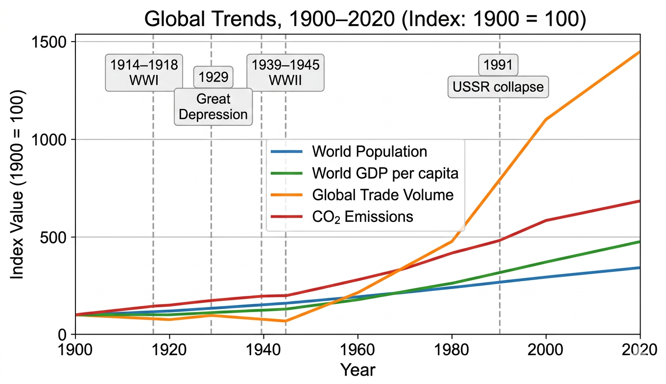
All four lines are indexed to 1900 = 100. Vertical dashed lines mark key historical events: WWI (1914–1918), Great Depression (1929), WWII (1939–1945), and USSR collapse (1991).
Questions & Explanations
Question 1. Based on Figure 1, which of the following best describes the relationship between Global Trade Volume and the other three indicators over the period 1900–2020?
- A) Global Trade Volume rose more slowly and steadily than all other indicators throughout the 20th century, reflecting the gradual nature of international economic integration
- B) Global Trade Volume was uniquely volatile, dropping sharply during wartime and the Depression while the other indicators continued growing, and then exploded far beyond the other three after the USSR's collapse in 1991 ✓
- C) Global Trade Volume and CO₂ Emissions followed identical trajectories throughout the 20th century, confirming that trade growth and environmental damage are directly proportional
- D) World Population grew faster than all other indicators after 1960, eventually surpassing Global Trade Volume as the single dominant driver of global economic activity by the century's end
Explanation: B is correct. The chart shows Global Trade Volume (orange) as the most distinctive line in two ways. First, it is the only indicator that actually declined sharply, dropping below its 1900 baseline during the Depression and WWII era while population, GDP per capita, and CO₂ continued rising. Second, after 1991 the trade line explodes upward to approximately 1,400 (fourteen times its 1900 level), far outpacing the other three indicators, none of which exceed 700 by 2020. This unique pattern of mid-century collapse followed by late-century explosion is the chart's most distinctive feature. A is wrong, trade volume was the most volatile indicator, not the most gradual; it dropped sharply mid-century and then grew far faster than others after 1991. C is wrong, CO₂ and trade volume track similarly in broad direction but diverge dramatically after 1991, when trade explodes while CO₂ grows more moderately. D is wrong, population (blue) is the lowest-indexed line by 2020 at approximately 330, far below trade volume's approximately 1,400.
Question 2. A historian using Figure 1 to argue that the post-1991 era represents a fundamentally new phase of globalization would be most strengthened by additional evidence that
- A) world population growth slowed after 1991, confirming that demographic pressures were not responsible for the trade explosion shown in the chart
- B) CO₂ emissions continued rising after 1991, confirming that economic growth after the Cold War did not address environmental sustainability
- C) global GDP per capita followed the same pre-1991 pattern after 1991, with no evidence that containerization, digital communication, or newly opened economies changed trade
- D) the post-1991 trade surge was driven by qualitatively new factors, containerization, digital communication, global supply chains, and the integration of China and former Soviet economies, rather than simply more of what had existed before 1991 ✓
Explanation: D is correct. The historian's argument is that post-1991 represents a fundamentally new phase, not just more trade, but a qualitatively different kind of integration. Evidence that the surge was driven by new structural factors (containerization reducing shipping costs, internet enabling global coordination, China's entry into global manufacturing, former Soviet economies joining world markets) would confirm that something structurally new emerged after 1991, not just a resumption of pre-existing trends. A is wrong, population growth rate data would not directly confirm whether the trade surge represents a new phase of globalization; the two are not causally linked in the argument. B is wrong, continued CO₂ rise is visible in the chart itself and would not add new evidence for the claim about globalization being a new phase. C is wrong, modest GDP per capita acceleration is already visible in the chart and adds only marginal support for the claim about qualitative newness.
Question 3. The sharp decline in Global Trade Volume visible in Figure 1 between approximately 1929 and 1945 is best explained by which combination of factors?
- A) The Great Depression triggered a global economic contraction and protectionist tariff policies (such as the Smoot-Hawley Tariff) that collapsed international trade, followed by WWII's disruption of global shipping and commercial relationships ✓
- B) The Soviet Union's deliberate strategy of economic autarky, pursuing complete self-sufficiency and withdrawing from world markets, which reduced global trade volume as other nations copied its model
- C) Rapid technological change in the 1930s made manufactured goods so cheap that nations could meet all domestic needs through local production, eliminating the economic rationale for international trade
- D) The League of Nations imposed comprehensive trade sanctions on all major industrial powers in response to the rise of fascism, forcing a global reduction in commercial exchange during the 1930s and 1940s
Explanation: A is correct. The chart shows the trade decline beginning around 1929 (Great Depression marker) and reaching its lowest point around 1945 (end of WWII marker). The historical explanation has two phases: the Depression triggered massive economic contraction, and protectionist responses, particularly the US Smoot-Hawley Tariff Act (1930), which raised tariffs on over 20,000 imported goods and prompted retaliatory tariffs from trading partners, caused global trade to collapse by approximately 65% between 1929 and 1934. Then WWII physically disrupted global shipping, closed markets, and redirected industrial production toward military goods rather than traded commodities. Together these explain the chart's dramatic dip. B is wrong; Soviet autarky affected Soviet trade but the USSR was already largely outside world markets before 1929; other nations did not widely follow the Soviet model of self-sufficiency. C is wrong, no such technological development occurred; the 1930s were characterized by depression, not technological abundance. D is wrong, the League of Nations never imposed comprehensive trade sanctions on major industrial powers; this is historically false.
Question 4. Figure 1 shows CO₂ emissions rising continuously throughout the 20th century even as other indicators fluctuated. Which of the following best explains this pattern?
- A) CO₂ emissions are produced primarily by agricultural activity rather than industry, so they remained high even during the Depression and wartime when industrial production declined
- B) CO2 emissions were caused entirely by population growth; as the world's population rose continuously throughout the century, emissions rose with it in direct one-to-one proportion across every single decade, independent of industrial output or energy sources, so recessions and wars had no separate effect.
- C) Industrial production, including military manufacturing during wartime, continued generating fossil fuel emissions even during economic downturns, and the steady expansion of industrialization globally meant emissions grew across virtually all periods regardless of trade or GDP fluctuations ✓
- D) CO₂ emissions are a lagging indicator that only reflect economic activity with a 20-year delay, which is why the chart shows them rising smoothly even when other indicators declined
Explanation: C is correct. CO₂ emissions continued rising even during the Depression and WWII because industrial production, including the enormous military manufacturing surge of WWII, was itself a major emissions source. Wars require steel, explosives, fuel, ships, aircraft, and vehicles, all of which generate emissions. As industrialization spread globally throughout the century (to the USSR, Japan, Latin America, and eventually China and India), the overall industrial base generating emissions expanded continuously even when specific economies contracted temporarily. The steady upward slope of the red line reflects the relentless global spread of fossil-fuel-based industrialization. A is wrong, while agriculture does produce some greenhouse gases, CO₂ emissions are dominated by fossil fuel combustion in industry, transportation, and energy production, not agriculture. B is wrong, while population and emissions are correlated, they are not directly proportional; emissions per capita also increased as industrialization deepened, making the relationship more complex than simple population proportion. D is wrong; there is no 20-year lag mechanism in CO₂ emissions; emissions reflect current economic activity, not past activity.
Question 5. Based on the trends shown in Figure 1, which of the following represents the most significant tension in 21st-century global development?
- A) The gap between world population growth and GDP per capita growth, which suggests that living standards are falling for most of the world's people despite economic expansion
- B) The divergence between explosive trade and GDP growth on one hand and steadily rising CO₂ emissions on the other, reflecting the challenge of sustaining economic globalization without accelerating environmental damage ✓
- C) The slowing of Global Trade Volume growth after 2010, which suggests that deglobalization is already underway and will reverse the post-1991 surge within a single generation
- D) The convergence of all four indicators toward a common index value by 2020, suggesting that economic and environmental trends are becoming increasingly synchronized and self-correcting
Explanation: B is correct. The chart's most important tension for the 21st century is visible in the divergence between the economic indicators (trade and GDP, rising sharply) and CO₂ emissions (also rising, but more moderately, yet still continuously upward with no sign of decoupling from growth). The central challenge of 21st-century sustainable development is exactly this: how to continue raising living standards and expanding economic opportunity, the goals represented by rising GDP and trade, without accelerating the environmental damage represented by rising CO₂. This is the core tension the AP World History CED identifies in the globalization unit. A is wrong; GDP per capita (green) is rising faster than population (blue) on the chart, suggesting average living standards are improving, not falling; this tension is not what the chart shows. C is wrong, the chart does not clearly show trade growth slowing after 2010; while the rate of increase may moderate, the line continues upward; "deglobalization is already underway" overstates what the chart shows. D is wrong, the four indicators are not converging; they are diverging, with trade at approximately 1,400 and population at approximately 330 by 2020, the gaps between lines are widening, not narrowing.